記事: A Modern Wardrobe, Made Personal: Ten Refined Outfit Ideas
A Modern Wardrobe, Made Personal: Ten Refined Outfit Ideas
A Modern Wardrobe, Made Personal
Ten fresh outfit ideas for playing with texture, color, and proportion while keeping everyday style entirely your own.
📋 TABLE OF CONTENTS
- What this lookbook is—and is not
- Start with the way you actually dress
- Look 1: Forest green and ivory
- Look 2: Burgundy knit and champagne
- Look 3: Butter cream and cocoa
- Look 4: Dove gray and soft ivory
- Look 5: Blue poplin and cocoa tailoring
- Look 6: Navy satin and ivory tailoring
- Look 7: Ivory knit and sage pleats
- Look 8: Terracotta and camel
- Look 9: Blush, cocoa, and cream
- Look 10: Blue knit and camel trousers
- Create a wardrobe map
- Work with color and texture
- Find the proportions that feel right
- Use accessories as the final edit
- Make outfits work in real life
- Care for what you choose
- Frequently asked questions
- Your wardrobe, your point of view
- Sources & References
What this lookbook is—and is not
This lookbook brings together ten outfit ideas and practical ways to adapt them. It focuses on styling choices such as color, layering, and shape. Use the looks as starting points, then choose garments based on verified product information and your own comfort, schedule, climate, and style.
The looks are visual styling concepts, not product listings or confirmation that a particular garment or material is available. Check the actual product information for fit, fiber, construction, and care details before choosing real pieces.
Instead of treating the ten outfits as a checklist, notice the small decisions that make each one feel complete. A dark shade may anchor a light palette. A crisp shirt can sit under a relaxed vest. A fluid skirt can balance a neat jacket. Once you can see these relationships, you can create a similar effect with pieces you already own, even if the colors and materials are different.
Start with the way you actually dress
Personal style begins with observation. Think about the outfits you reach for repeatedly, then ask what they have in common. Perhaps you like a defined shoulder, a comfortable waist, a longer layer, or a small point of color. Maybe you prefer to move freely and dislike garments that need frequent adjustment. These details matter more than a generic style label because they explain why certain clothes make you feel at ease.
Choose one familiar piece as the anchor for a new combination. It could be a blazer, a favorite knit, a pair of tailored trousers, or a skirt you know you can wear comfortably. Add one piece that changes the texture or proportion, then finish with a practical shoe. This limited approach keeps experimentation low-pressure. If the result feels too formal, swap one structured element for a softer one. If it feels too plain, add one color accent or tactile layer.
Comfort is not an afterthought. Stand, sit, walk, and lift your arms while trying the pieces together. A look that seems polished only when you remain still may not be right for a full day. Check the hem with the shoes you intend to wear and see whether an outer layer closes comfortably over the rest. If something pulls, slips, scratches, or feels cumbersome, adjust it rather than assuming you must tolerate it for the sake of style.
The aim is not to dress like an image. It is to use an image as a visual prompt, then make decisions that suit you. One person may keep the silhouette slim and add a dramatic coat; another may choose a relaxed trouser and a fitted top. Both can be thoughtful interpretations. Your daily routine and preferences are the design brief.
Look 1: Forest green and ivory

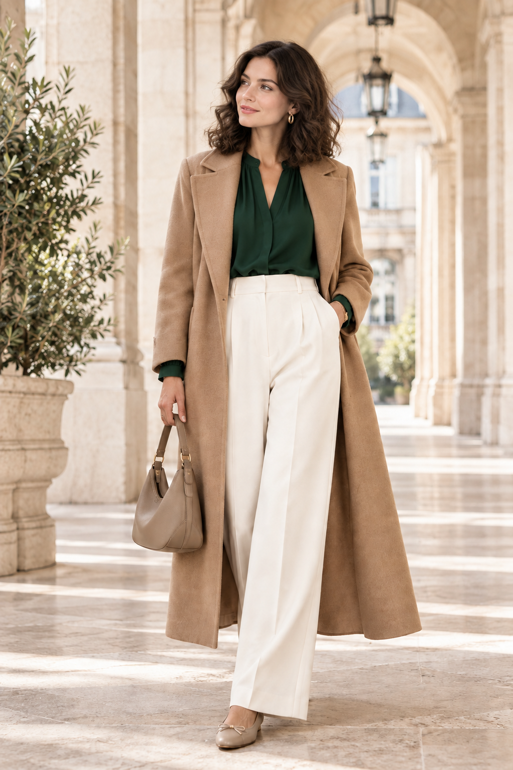
The first combination uses a deep forest-green blouse, ivory trousers, and a warm camel coat. The dark blouse gives the outfit a clear center, while the trousers reflect light and make the lower half feel open. Camel sits between those two values, giving the outfit a warm bridge rather than a sharp color break. The palette feels composed because each shade has a distinct job.
To make the formula your own, choose a top that feels comfortable at the neckline and shoulders. A blouse works for a softly polished result; a simple fine knit can make the same colors feel more casual. The trousers can be wide, straight, or gently tapered, depending on the footwear and the movement you want. Try the coat open first, then see whether closing it changes the proportion in a way you enjoy.
Accessories do not need to repeat every shade. A neutral shoe or a small bag can keep attention on the green and ivory, while a tan belt can connect to the coat. If you prefer a more relaxed outfit, remove the coat and let the blouse and trousers stand alone. If you want a stronger evening feeling, choose a more defined shoe and keep the rest of the accessories restrained.
This look also shows why a darker color does not need to be black to anchor an outfit. Deep green can feel rich while still pairing naturally with light neutrals. The exact shade matters: some greens appear cooler, others warmer. Hold the garment beside the neutrals you already own, and decide whether the combination feels harmonious to your eye.
Look 2: Burgundy knit and champagne

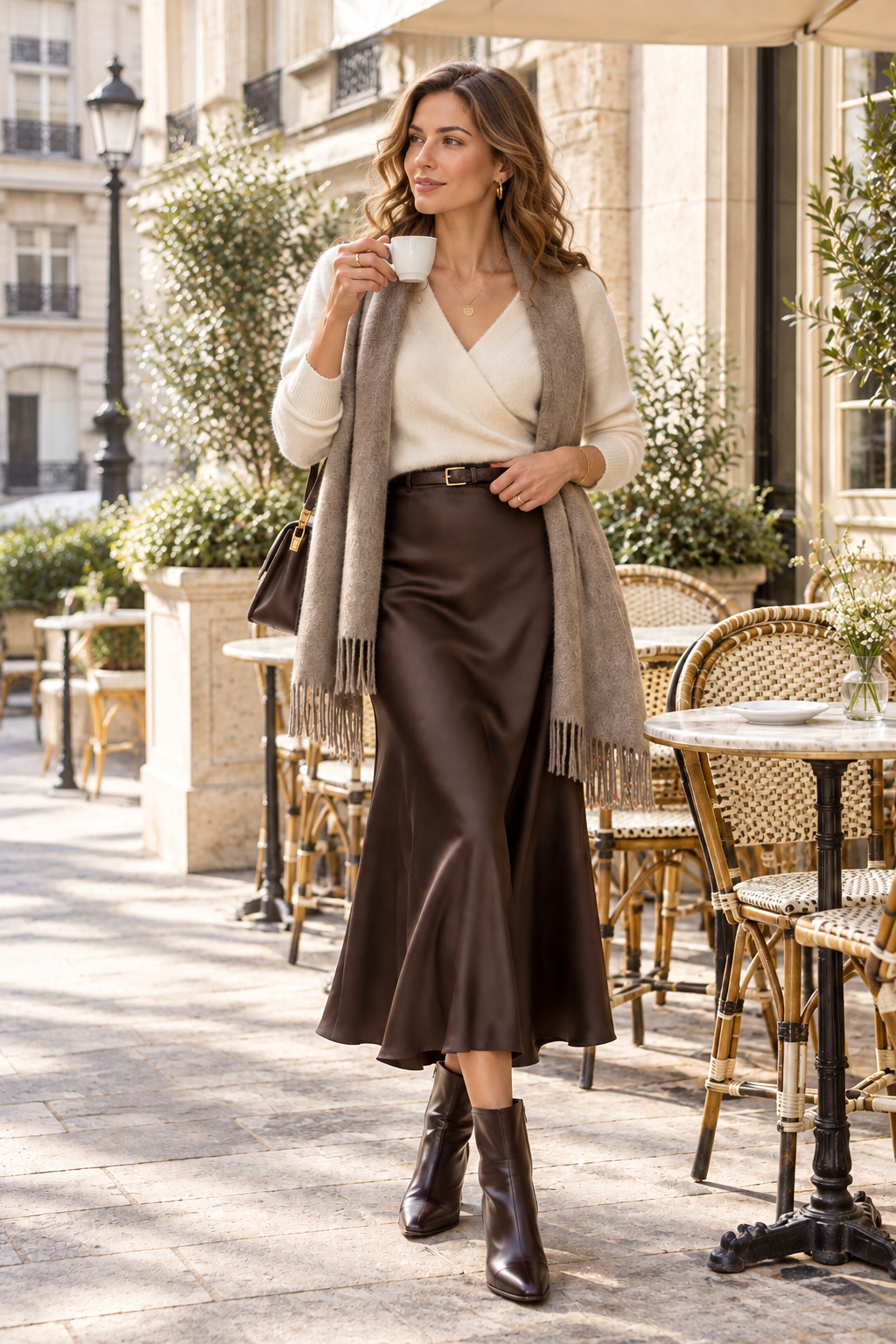
Burgundy makes a small color statement while remaining easy to pair with cream, champagne, cocoa, and many warm neutrals. Here, a textured cardigan sits beside a flowing midi skirt. The knit contributes a soft, close-up surface; the skirt moves more freely and catches light differently. Their contrast gives the outfit character without requiring a bold print or elaborate accessories.
When adapting the combination, think about where the cardigan ends. A shorter layer can bring attention to the waist, while a longer one may create a softer vertical line. Wear it open if you want to show the top beneath, or fasten it when the shape feels balanced. The skirt can be pleated, smooth, or gently gathered; choose a construction that feels comfortable for the setting and does not require constant adjustment.
Burgundy can look dramatic when used across a large area, so you might start with a smaller dose: a cardigan, scarf, or bag. If you already own a burgundy item, treat it as the accent and build around it with pieces in a quiet neutral. A shoe in a related brown tone can connect the colors without matching them exactly. Simple earrings can finish the look while keeping the outfit's texture at the center.
Consider the occasion before choosing the final pieces. A relaxed knit and flat shoe can make the outfit suitable for everyday plans; a more structured cardigan and refined shoe can shift its mood. The color formula stays consistent while the garment details change. This is useful because a good outfit idea should be adaptable, not dependent on reproducing one exact photograph.
Look 3: Butter cream and cocoa

This look layers a light blazer over a cocoa-colored satin dress. The dress provides a continuous line, and the blazer adds structure around the shoulders. The difference in surface is as important as the difference in color: one garment is smooth and fluid, the other more tailored. The result is balanced rather than overly formal because the pieces have contrasting roles.
If a dress is not part of your wardrobe, use a cocoa skirt and a matching or related top to create a similar column. A cream jacket can be short, waist-length, or longer; test it over the outfit to see where it creates the most comfortable balance. You can also reverse the colors by wearing a pale base and a dark outer layer. The most useful part of the idea is the contrast between a fluid garment and a structured layer.
Pay attention to fit at the shoulder and sleeve. A jacket should allow movement and sit naturally over the layer beneath it. If it feels too stiff, try a softer cardigan or an unstructured jacket in a similar light color. The outfit should work while walking and sitting, not just while standing in front of a mirror. A slight change in sleeve length or hem may make the combination feel much more natural.
Keep accessories simple if the dress already catches light. A small bag and understated jewelry can be enough. If you prefer more detail, choose one feature to emphasize, such as a belt or earrings, rather than adding several competing accents. The purpose of editing is to let the outfit's main relationship remain visible.
Look 4: Dove gray and soft ivory

Dove gray and ivory create a softer alternative to high-contrast black and white. The knit adds a quiet texture, while the pale coat keeps the silhouette light. Opaque tights and a short skirt make the look more suited to particular weather and settings, but the color relationship can be translated into trousers or a longer skirt just as easily.
Use the gray garment as a calm anchor and let ivory supply brightness. If the palette feels too pale, add a deeper shoe or bag to ground it. If you want to keep the result very soft, choose a gray that has a similar temperature to the ivory rather than a sharp, cool silver. The important point is not an exact shade but the gentle movement between the two colors.
Layering short and long pieces can create contrast in proportion. The long coat frames the shorter lower layer, while tights visually connect the legs and shoe. If that silhouette is not comfortable for you, a longer skirt under the same coat can retain the layered mood. Styling should support the wearer rather than make a body-type promise. Choose proportions that feel balanced and practical to you.
For a casual version, try a soft knit, a clean skirt or trouser, and a flat boot. For a dressier version, retain the light palette but add a more defined jacket or polished shoe. In either case, check the weather and make sure the fabrics work for the conditions. A beautiful light layer is most useful when you can wear it comfortably throughout the day.
Look 5: Blue poplin and cocoa tailoring

A pale-blue shirt offers a fresh note beside cocoa trousers, while the sand-toned waistcoat brings both texture and a transition between the two. The structure is neat but not rigid. Shirt collar and cuffs can peek from beneath the vest, creating small details that make the layers feel intentional. The palette keeps the look polished without depending on a matching suit.
Fit through the shoulders is important when layering. A shirt should leave room beneath the vest, and the vest should close or sit comfortably without pulling. If the layers feel bulky, try a lighter shirt or wear the vest open. You can also replace the waistcoat with a simple cardigan or blazer while keeping the blue-and-cocoa relationship intact.
The trouser silhouette changes the mood. A wide leg feels fluid and can balance the fitted outline of the vest. A straight leg creates a cleaner, more classic line. Shoes can be selected to suit the hem and the amount of walking planned. Do not force a specific shoe style because it appears in the image; choose the pair that supports your day.
Blue and brown can make a useful color pairing when their undertones feel compatible. If a cool blue and warm cocoa seem disconnected, add a neutral that sits between them, such as sand, cream, or taupe. That middle tone can come from a vest, belt, scarf, or coat. A small bridge is often more effective than trying to make every shade match exactly.
Look 6: Navy satin and ivory tailoring

A navy dress under an ivory jacket is a straightforward way to combine a dark anchor and a light frame. The smooth dress brings movement, while the jacket sharpens the upper silhouette. A small unbranded clutch can provide a practical finishing piece, but the outfit works without it. The visual clarity comes from the two main garments and the restrained palette.
To adapt the formula, try a navy top with ivory trousers, or a pale blouse with a navy skirt. If you prefer not to wear a dress, a matching top and lower piece in related shades can create a similar long line. A blazer can be worn open, buttoned, or replaced by a cardigan depending on the setting. Each version can remain polished without feeling overly dressed up.
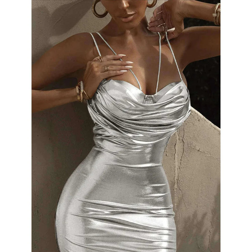
Think about how the fabric behaves in movement and under light. The image suggests sheen, but real garments vary in fiber, finish, and care. Check product details instead of assuming a piece is made from a particular material. If you prefer less shine, a matte navy fabric can preserve the color story. If you like a more evening-oriented effect, let one smooth surface carry the light.
Footwear sets much of the tone. A clean flat can make the combination practical; a low heel or refined boot can add formality. Check the hem with the chosen shoe and make sure you can walk comfortably. The most successful version is the one that feels appropriate for the actual place you are going.
Look 7: Ivory knit and sage pleats

The combination of ivory knitwear, a pale-blue shirt, and a muted sage skirt uses three quiet colors with different temperatures. The shirt gives the upper half a crisp edge, the knit softens it, and the pleated skirt introduces movement. Tan flats keep the palette warm and grounded. Each piece contributes something different, which prevents the outfit from feeling like one flat block of color.
When combining three colors, choose one to lead. Here the pale top layers draw attention first, while sage provides the main lower color. If you would rather emphasize the skirt, choose a closer-to-body top or simplify the shirt detail. If the layers feel crowded, remove one and keep the color story. The same skirt can work with a fine knit alone, while the shirt can be styled with trousers or jeans.
Pleats add movement but can also add visual activity. Keep accessories restrained if the skirt already creates a strong line. A small neutral bag or simple earrings can finish the outfit without competing. If you enjoy more detail, introduce one patterned accessory in related shades and keep the rest of the garments simple.
Consider the day ahead. A light skirt and flats can be comfortable in some settings but not all. Weather, walking distance, and dress expectations should inform the final choice. The image is inspiration, not a rule. The formula can be translated into a sage trouser, a different shoe, or a shorter knit if that works better for you.
Look 8: Terracotta and camel

A terracotta blouse, ivory trousers, and an open camel layer form a warm palette that still feels light. The terracotta gives the outfit a point of color, and the camel coat frames rather than hides it. The blouse has gentle detail at the sleeves, which creates interest near the face without requiring a strong print. The overall impression comes from warm colors arranged at different depths.
If terracotta feels too bold in a full blouse, introduce it through a scarf or a smaller accessory. If you enjoy the color, let it lead and keep the surrounding pieces simple. Ivory trousers provide brightness, but another pale neutral can work just as well. Choose the shade that already connects naturally to your wardrobe.
An open coat or trench can elongate the visual line, but it should be easy to wear. Check that the sleeves do not restrict the blouse, and that you can carry the layer if the day becomes warmer. For a more compact version, replace the long coat with a short jacket. The warm color story will remain even as the silhouette changes.
Shoes can either echo the camel or introduce a darker grounding tone. A tan flat keeps the look soft; a deeper shoe adds contrast and may be more practical for some settings. There is no required match. Choose the pair that works with the garment hem and the walking you expect to do.
Look 9: Blush, cocoa, and cream

Blush appears here as a gentle outer layer over cocoa knitwear and a cream pleated skirt. Each shade is distinct, but none overwhelms the others. The darker knit helps the pale jacket and skirt feel connected rather than overly sweet. Tall boots add definition and extend the line, though a different shoe can make the look more casual or more formal.
Muted blush can pair well with cocoa because the brown tempers the lightness of the pink. If your wardrobe includes mostly cool neutrals, choose a blush that leans cooler; if it is warm, look for a soft rose tone with a warmer cast. The specific shade is personal. Try it beside the garments you already wear to see whether it feels natural.
The skirt's pleats create movement, so keep the knit and jacket relatively simple. If you want to add an accessory, choose one that either repeats a color or supports the practical needs of the day. A scarf might work in cooler weather, but it is not necessary if the neckline already feels complete. Styling is often improved by leaving enough space around the interesting details.
For a more understated version, use a blush scarf over an ivory knit and cocoa trousers. For a bolder version, make the jacket the focus and keep the lower half more uniform. The underlying principle is a balance between a soft accent and a deeper neutral.
Look 10: Blue knit and camel trousers

The last look pairs a muted-blue knit with camel trousers and a pale coat. The blue gives the outfit a cool note, while camel adds warmth below. A light outer layer ties the two together and gives the look more depth. This is a useful example of mixing cool and warm colors without relying on a perfectly matched set.
Try the combination with a blue shirt, sweater, or fine knit depending on how much structure you want. Camel trousers can be wide, straight, or tapered, and the choice changes the outfit's movement. A light coat adds a longer line; if that feels too much for your routine, switch to a shorter jacket. Keep the base colors in place and change only one proportion at a time.
A small gold-toned detail can echo the warmth of camel, but the outfit does not need jewelry to feel finished. A neutral shoe can keep it understated, while a deeper shoe creates a grounding point. Before choosing accessories, check whether the outfit already has enough contrast and whether an extra item would support a real need.
Blue and camel can be repeated in different combinations across a wardrobe. A blue top can work with cream, charcoal, or denim; camel trousers can pair with ivory, burgundy, green, or white. This makes the palette adaptable. The value is not in reproducing the image but in discovering how a few colors can move between different parts of your closet.
Create a wardrobe map
A wardrobe map helps connect individual pieces to the outfits you actually wear. Start by listing a few reliable garments and the roles they play. One may be your everyday layer, another the trouser that works for long days, and another the skirt you choose when you want more movement. Note the colors and shapes you reach for most often. This small inventory can reveal useful gaps and combinations that you may not have tried yet.
Next, make a simple grid with tops, lower pieces, and layers. You do not need a complicated spreadsheet. A few notes or photographs can show whether one top works with multiple bottoms, whether a jacket fits over your knits, and which shoes work with certain hems. Look for combinations that need only one additional item to feel finished. That item may be a scarf or belt you already own, not a new purchase.
Think in terms of repeatability. A look that works once for a photograph but never fits your calendar is less useful than a comfortable outfit you can repeat with small changes. Identify what makes your favorite combinations easy: perhaps a consistent color palette, forgiving fabrics, a reliable shoe, or layers you can remove. Use those observations to evaluate future garments.
A wardrobe map should remain flexible. Seasons change, routines change, and personal preferences change. Review it occasionally and remove assumptions that no longer fit. The goal is to support better decisions, not to restrict experimentation. If a new color or shape catches your interest, try it with a trusted piece and see how it feels before deciding whether it belongs in your closet.
Work with color and texture
Color and texture can do different jobs in an outfit. Color organizes the overall impression; texture gives the eye something to notice up close. A tonal outfit can remain interesting when it includes both smooth and tactile surfaces. A stronger color combination can feel calmer when the shapes are simple. Decide which element you want to lead, then let the other support it.
When colors seem disconnected, find a middle shade. A cream, sand, or taupe piece can bridge a cool blue and warm brown. The bridge can be a large garment or a small accessory; it does not need to match either color exactly. If you prefer a clean, high-contrast result, skip the bridge and let the difference remain clear. The best choice depends on the mood you want.
Texture should be judged on real garments, not inferred from images. Similar-looking surfaces can come from different fibers or finishes, and those differences affect comfort, care, and durability. Check labels and product descriptions for exact material details. If a texture matters to you, consider how it feels against the skin and how it behaves through a day of wear.
Too many competing details can make an outfit feel less settled. If you have a strong pattern, use simpler pieces around it. If you have several tactile layers, keep the color palette narrow. If the silhouette is already dramatic, reduce accessories. These are editing options, not rules. You can break them intentionally when you want a bolder or more expressive result.
Find the proportions that feel right
Proportion is about the relationship between garment lengths and volumes, not about correcting a body. A long coat over a clean base creates a different mood than a cropped jacket over a wide trouser. A relaxed blouse can feel balanced with a straighter skirt, while a slim top may pair well with a fuller lower piece. Try these combinations in your own clothes and pay attention to how they feel as you move.
Do not rely on a mirror pose alone. Walk, sit, bend, and reach. Check whether the layers shift, whether the hem catches, or whether a sleeve feels restrictive. A garment should not need constant adjustment to maintain its shape. If it does, a small fit change or different pairing may improve the outfit more than a new accessory.
Footwear changes proportions quickly. A shoe with a higher profile may alter where a wide trouser hem falls; a flat shoe can make a longer skirt feel more casual. Always try the outfit with the pair you intend to wear. If you often switch shoes during the day, consider whether the garment hem works with both or whether a simple alteration would make the outfit easier.
Volume can be softened through visible transitions. A cuff, neckline, or belt can help separate layers, but it is optional. Some outfits look best when the pieces fall freely. Let comfort guide the final decision rather than trying to satisfy a universal silhouette rule.
Use accessories as the final edit
Accessories can finish an outfit, but they do not need to be the first decision. Begin with the garments and determine whether the outfit already has enough color, texture, and shape. Then choose accessories that add function or clarity. A bag should carry what you need. A belt should work with the garment. A scarf should feel comfortable and suit the weather. Shoes should support the distance and surface you expect.
Repeating one shade in two places can make an outfit feel connected. A brown belt and brown shoe may echo a cocoa garment, while a gold-toned earring can relate to warm camel or terracotta. Exact matches are unnecessary. A slight variation can feel more natural than a coordinated set. If a look is already detailed, choose fewer accessories so the eye can rest.
Consider scale. A narrow scarf and a delicate jacket may work together; a very large wrap may overwhelm the neckline. A small bag can be elegant but may not suit a full workday. A bold earring may become the focal point, which is helpful when the outfit is otherwise quiet. Ask what you want the accessory to do before adding it.
One last edit can be useful: remove an item and see if the outfit feels clearer. If you miss it, put it back. This simple comparison helps distinguish a useful detail from one that is present only by habit. Personal style is allowed to be expressive; the edit is there to help each choice feel intentional.
Make outfits work in real life
Wearability begins with the day ahead. Consider how long you will be outside, whether you will be walking, sitting, commuting, or carrying items. Choose a shoe that suits the route. Choose layers you can remove and carry. Choose fabrics that feel comfortable for the temperature. A look that makes daily movement harder is not a successful outfit for that day, even if it photographs beautifully.
Dress expectations matter too. A workplace, event, or travel destination may call for different levels of coverage, structure, or practicality. Use the same palette in different forms: a blazer for a more structured setting, a cardigan for a softer one, a practical trouser when you need mobility, or a skirt when it suits your plans. The outfit formula should help you respond to the setting rather than ignoring it.
Build a small number of dependable combinations for rushed mornings. Keep them flexible by noting which layers and shoes work with each base. Then leave room for changes in weather and mood. A reliable formula should not become a uniform you cannot vary. Switch a color, remove a layer, or add a scarf when you want a different feeling.
At the end of the day, notice what you adjusted. If you kept pulling at a sleeve, changed shoes, or removed a layer, that information can guide future outfit choices. Practical feedback is valuable. It helps you select garments and combinations that make getting dressed easier next time.
Care for what you choose
Good styling includes accurate information about garments. An editorial image cannot establish fiber content, construction, lining, or care. Read product details and garment labels before deciding how to wash, steam, store, or clean an item. Two pieces with similar appearances can require different care. Follow the instructions for the specific garment rather than relying on general assumptions.
Think about care before buying. If you know you prefer easy-care pieces, choose items whose verified instructions fit your routine. If a delicate texture is worth the extra attention to you, plan for that care rather than discovering it later. Consider how often you will wear the item and whether it works with the clothes you already own.
Storage can help keep garments usable. Some knits may stretch on hangers; tailored pieces may benefit from appropriate support; delicate surfaces may need protection from snags. Follow manufacturer recommendations and use a method that suits the item. Let garments dry completely before storing, and make room so they are not crushed into a crowded space.
Care is not about making clothes last forever. It is about treating them in a way that suits their construction and helps you get meaningful wear from them. When a garment no longer fits your needs, consider repair, alteration, resale, or donation where practical. Choose the option that is available and appropriate for its condition.
Frequently asked questions
How should I use this lookbook?
Use it for styling inspiration. Notice the color, texture, and proportion in each combination, then adapt those ideas to clothes that fit your comfort, routine, and personal style.
Are the looks shown for sale as exact KIMLUD products?
The looks are visual styling concepts, not product listings. Check the product pages for verified material, fit, construction, and availability details.
How can I recreate a look with clothes I already own?
Choose one anchor garment and rebuild the relationship around it. Try a different texture, add a light layer, or repeat one color in a second place. The goal is to adapt a formula, not copy every detail.
Do I need to wear neutral colors to use these ideas?
No. The combinations can be adapted to brighter colors or patterns. Keep the same approach to contrast, proportion, and comfort while choosing shades that feel personal to you.
How many colors should I wear at once?
There is no fixed number. If you want an easy starting point, choose one main color, one supporting neutral, and a small accent. Add or remove colors depending on how the outfit feels to you.
How can I tell whether layers fit well together?
Try them on together and move naturally. Check the shoulders, sleeves, waist, and closures. If fabric pulls or bunches, try a lighter layer or a different size or silhouette.
How do I choose shoes for a skirt or wide trouser?
Try the garment with the shoes you intend to wear and check the hem while walking. The right choice depends on comfort, length, weather, and the surface you will be walking on.
Can the images confirm the fabric in a real product?
Use the product's verified materials and care information. Styling images can suggest a visual mood but do not replace product details.
Should I buy new pieces to follow this lookbook?
Not necessarily. Start with what you own and see whether one styling adjustment creates the effect you want. If you shop, verify the details and choose a piece that works with several items already in your wardrobe.
Your wardrobe, your point of view
Ten outfits can offer ten different starting points, but none needs to become a rule. Keep the combinations that feel comfortable, adapt the ones that catch your eye, and leave behind what does not fit your routine. A wardrobe becomes personal through the choices you repeat and the details you make your own. Use the images as prompts for color, proportion, and texture, then get dressed in a way that feels true to you.
Explore the KIMLUD Women’s Fashion, Women’s Tops, Skirts, Dresses, and Jewelry & Accessories collections for pieces to make these outfit ideas your own.
Sources & References
- KIMLUD Official Collections — www.kimlud.com
- KIMLUD Fashion Editorial Blog — www.kimlud.com
- KIMLUD Tech Editorial Blog — www.kimlud.co
No external sources cited.