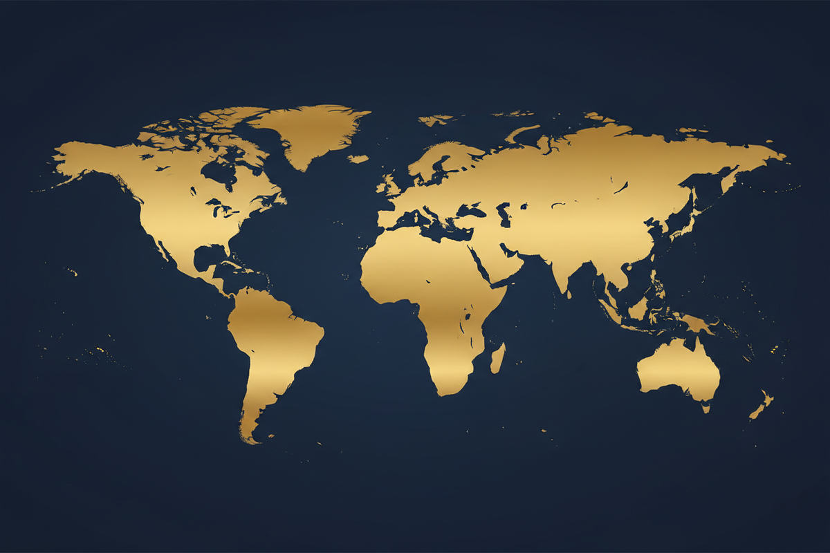

記事: UN Votes to Promote Equal-Area Maps Over Distorted Mercator Projection
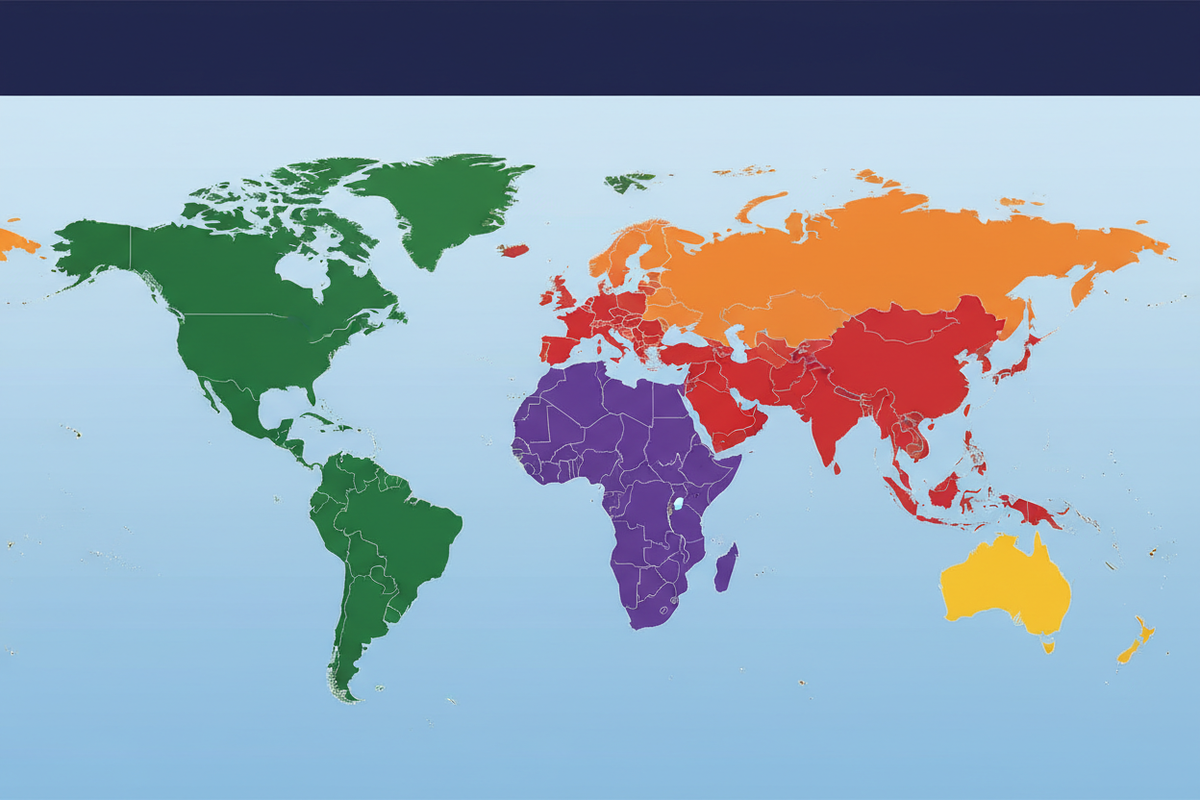
UN Votes to Promote Equal-Area Maps Over Distorted Mercator Projection
UN VOTES TO CHANGE THE WORLD MAP
How the United Nations' Historic 164-to-1 Vote on Equal-Area Maps Is Reshaping How Humanity Sees Our Planet
📋 TABLE OF CONTENTS
- Introduction: A Vote That Changed the Map
- What the UN Actually Voted On — September 4, 2026
- Why the Mercator Map Is So Controversial
- The Mathematics of Distortion
- Africa at the Center of the Debate
- What Is an Equal-Area Projection?
- Enter Equal Earth: The Leading Alternative
- The UN Vote Was Not a Ban on Mercator
- The Politics of a Map
- The Classroom Question
- What Happens to Digital Maps?
- The United States' Opposition
- France and Other Early Adopters
- Africa Today: Staggering Scale and Potential
- A More Accurate Mental Map
- Frequently Asked Questions
- Sources & References
Introduction: A Vote That Changed the Map
For centuries, the world has been taught through maps that make some countries and continents appear dramatically larger — or smaller — than they really are. Children have grown up absorbing a visual hierarchy of continents that bears little relationship to physical reality. Greenland appears comparable in size to Africa. Europe looks as large as South America. Russia dominates the entire northern hemisphere like a colossus. And Africa, the world's second-largest continent covering 30.37 million square kilometres, appears curiously modest — dwarfed by territories that are, in reality, a fraction of its actual size.
Now, the United Nations has taken a historic step toward correcting that picture.
On September 4, 2026, the United Nations General Assembly overwhelmingly approved a resolution calling for a more balanced representation of the world's geography — encouraging the use of map projections that more accurately portray the relative size of continents and nations. The resolution passed by 164 votes to one, with six countries abstaining. It was a moment that cartographers, geographers, educators, and advocates for equitable global representation had been working toward for decades.
This article explores exactly what happened, why it matters, what the science and history of map projections tells us, and what the future of world maps might look like — for classrooms, digital platforms, governments, and the collective human imagination.

What the UN Actually Voted On — September 4, 2026
The resolution approved by the UN General Assembly was titled: "Correct the Map: Rebalancing Global Cartographic Representation and Promoting Equitable Representation of the World's Regions, Particularly Africa." The campaign behind it, led by Togo and supported by the African Union, argued that the widespread use of the Mercator projection has created a deeply misleading visual impression of the relative size of continents — one that has persisted in classrooms, government offices, and media for over four centuries.
The vote was not close. 164 nations voted in favour. Only the United States voted against. Estonia, Georgia, Lithuania, Moldova, Serbia, and Ukraine abstained.
Togolese Foreign Minister Robert Dussey framed the initiative in terms that resonated far beyond cartography: "A fair map does not change the geography of the world — it changes how people see the world." That sentence captures the essence of the entire debate. Africa has always been the size it is. The map does not physically alter the continent. But centuries of repeated visual misrepresentation have shaped how billions of people intuitively understand the world's geography — and with it, the perceived importance, scale, and significance of its regions and peoples.
Critically, the resolution is non-binding. It does not ban the Mercator projection, mandate a specific replacement, or legally require any government, school, or technology company to change their maps. What it does is send a powerful symbolic and institutional signal: when maps are used to compare the size of the world's regions, the world deserves to be shown as accurately as possible.
Why the Mercator Map Is So Controversial
The Mercator projection was created by Flemish cartographer Gerardus Mercator in 1569. Its purpose was never to provide a perfectly accurate picture of the world's continents. It was designed for one specific task: to help sailors navigate.

A globe is the most natural representation of Earth because Earth itself is approximately spherical. A flat map must transform that three-dimensional surface onto a two-dimensional sheet or screen. Mathematics makes it impossible to preserve everything simultaneously. Any flat world map must distort at least some combination of area, shape, distance, or direction.
Mercator's great advantage was its treatment of direction. Lines representing constant compass bearings could be drawn as straight lines on his projection — a property called conformality or rhumb-line accuracy. For 16th-century sailors navigating by compass across open oceans, this was a lifesaving innovation. You could draw a straight line on a Mercator map, follow that compass bearing, and arrive at your destination.
The problem arises when the same projection is used to answer a completely different question: how large are the world's countries and continents relative to one another? For that question, Mercator is profoundly misleading. As latitude increases away from the equator, land masses are progressively and dramatically enlarged. The closer to the poles, the more extreme the distortion becomes.
The result is a famous and deeply embedded visual illusion. Greenland appears comparable in size to Africa on a conventional Mercator world map. In reality, Africa is approximately 14 times larger than Greenland. Europe appears comparable to South America — but South America is nearly twice Europe's actual size. Canada and Russia appear to dominate the planet, while India, Southeast Asia, and sub-Saharan Africa appear compressed and diminished.
The Mathematics of Distortion
To understand why the Mercator projection distorts the way it does, imagine trying to peel an orange and lay the skin perfectly flat. It cannot be done without stretching or tearing. The only way to make it lie smooth is to stretch it — and the stretching must be greatest at the edges, farthest from the centre.
The Mercator projection applies a systematic mathematical stretching formula. At any given latitude, the map is stretched both horizontally and vertically by the secant of the latitude angle. At the equator, this factor is 1 — no distortion. At 60° latitude (St. Petersburg, Oslo, Anchorage), the distortion factor is 2 — everything appears twice as large as it should. At 80° latitude (approaching the Arctic), the factor reaches approximately 5.76 — nearly six times actual size.

Greenland sits between approximately 60° and 83° north latitude — deep in the zone of maximum distortion. Its actual area is 2.17 million square kilometres. Africa, straddling the equator, is rendered at near-accurate scale: 30.37 million square kilometres. On a Mercator map, these two landmasses can appear roughly comparable. The disparity in the map is not a small rounding error. It is a 14-fold distortion that has been displayed in classrooms and government offices around the world for four centuries.
Africa at the Center of the Debate
Africa has become the central focus of the United Nations initiative — and for good reason. No continent has been more dramatically misrepresented by the Mercator projection than Africa, and no continent stands to benefit more clearly from a shift toward equal-area mapping.

Africa covers approximately 30.37 million square kilometres. To make that number tangible: you could fit the entire United States (9.83 million km²), China (9.60 million km²), India (3.29 million km²), and all of Europe (10.18 million km²) inside Africa — and still have space left over. Greenland, which on a Mercator map appears almost comparable to Africa, covers just 2.17 million square kilometres — a landmass Africa is 14 times larger than.
Maps are often among the first tools children use to understand the world. Before many students learn the precise populations, economies, or histories of different regions, they encounter a visual hierarchy of continents. The African-led "Correct the Map" campaign argues that this matters because the distortion has persisted for generations, contributing to a systemic undervaluation of Africa's geographic scale and, by extension, its economic potential, demographic significance, and cultural weight.
What Is an Equal-Area Projection?
The phrase "equal-area" describes a family of map projections that attempt to preserve the relative areas of geographical regions. If one country is twice the actual size of another, its representation on an equal-area map should also occupy roughly twice as much map space.
That does not mean an equal-area map is perfect. Because Earth is curved and a map is flat, an equal-area projection must compromise somewhere else. Countries may become stretched or compressed in shape. Directions and distances may not remain accurate everywhere. This is the fundamental cartographic truth: there is no single flat map that can preserve every geographic property simultaneously.
Different projections are designed for different purposes. Mercator prioritises directional accuracy useful for navigation. Equal-area projections prioritise size accuracy useful for geographic comparison. Compromise projections — like Robinson or Winkel Tripel — attempt to balance several properties at acceptable levels of distortion across all of them. The United Nations itself has historically used multiple projections for different purposes, including Robinson, Winkel III, and Eckert IV.
The key insight — which the UN resolution enshrines as institutional guidance — is to match the projection to the purpose. For global comparisons of land area, an equal-area projection is the appropriate choice. For maritime navigation, Mercator retains its historical and technical value. For general-purpose educational maps, projections that balance multiple types of distortion are preferable to one that catastrophically distorts area in favour of directional accuracy.
Enter Equal Earth: The Leading Alternative

One of the most prominent alternatives in the current debate is the Equal Earth projection, developed in 2018 by cartographers Bojan Šavrič, Tom Patterson, and Bernhard Jenny. It is an equal-area projection specifically designed to provide a visually balanced world map while preserving the relative sizes of land masses.
Equal Earth attempts to solve two problems simultaneously: maintaining accurate relative area while producing a world map that remains visually recognisable and aesthetically balanced. That makes it particularly attractive for educational and public-facing maps. On an Equal Earth map, Africa's enormous area becomes immediately and unmistakably apparent. Greenland shrinks to its actual modest size. Europe and North America lose some of the exaggerated visual scale they acquire on Mercator maps.
The result can initially look strange to people who have spent their lives seeing the world through Mercator-based maps. That discomfort is itself revealing — it demonstrates how powerfully a particular projection can shape our mental image of the planet.
The UN Vote Was Not a Ban on Mercator
Despite some headlines suggesting that the United Nations has "banned" or "abolished" the Mercator projection, that is not what happened. The resolution is non-binding. It does not force governments to remove every Mercator map from classrooms, prohibit navigational uses of the projection, or mandate that technology companies redesign their mapping platforms.
What the resolution does is encourage the adoption of cartographic representations that more accurately communicate relative area, particularly when geographic size is relevant. The Equal Earth projection is frequently associated with the initiative, but the broader principle is the promotion of more equitable and accurate geographic representation — not the imposition of one universal map.
That distinction is important. Mercator remains a valid and effective projection for certain applications. Its historical importance in navigation is enormous. A map used to teach the relative size of continents has different requirements from a chart used for navigation. The question is not whether Mercator should cease to exist. It is whether it should continue to be treated as the default visual representation of the entire planet in contexts where its area distortion is profoundly misleading.
The Politics of a Map
Why did a question of cartography reach the United Nations General Assembly? Because maps have never been purely technical objects. Throughout history, maps have helped governments define territories, project power, organise colonies, and communicate political ideas. During the age of European colonial expansion, maps became important instruments of administration and control.
The African Union-backed campaign argues that the continued dominance of a map that visually reduces Africa contributes to an outdated global worldview. Critics, however, caution against assuming that the Mercator projection was deliberately designed to make Europe look powerful or Africa look weak. The historical evidence points to a practical navigational origin, not a political conspiracy.
That distinction should be preserved. The projection was created centuries before today's debates about decolonisation and representation. It would be misleading to claim that Mercator was invented as a political tool for European domination. Nevertheless, an originally technical design can acquire political and cultural consequences through repeated use. A map does not need to have been deliberately designed to produce a particular political effect for its visual conventions to influence people's perceptions over generations.
The Classroom Question

Perhaps the biggest practical impact of the UN resolution will occur in schools. For generations, students in many countries have encountered maps based on Mercator or similar projections. These maps are convenient, familiar, and visually powerful. But if the purpose of a lesson is to compare the sizes of continents, an equal-area map communicates the concept far more effectively.
Imagine a child seeing Africa and Greenland side by side. On a Mercator map, the two may appear surprisingly similar in size. On an equal-area projection, their enormous difference becomes immediately and viscerally obvious. That single visual correction could shift a child's intuitive understanding of the world in ways that persist for a lifetime.
Educational organisations may increasingly adopt multiple maps rather than presenting one projection as the definitive picture of the world. Students could learn that Mercator is a navigation-oriented projection, Equal Earth is designed to preserve area, and other projections provide different compromises. That would be more genuinely educational than simply replacing one default map with another.
What Happens to Digital Maps?

The digital age presents a far more complicated challenge. Traditional wall maps can be replaced relatively easily. Digital mapping systems are deeply integrated into navigation, smartphones, websites, geographic information systems, and location-based services. Many online mapping systems use projections optimised for interactive navigation rather than global comparison — and for good practical reasons.
A digital map must allow users to zoom, pan, search for addresses, and navigate streets. The mathematical requirements of those operations differ significantly from those of an educational world map. Technology companies therefore face a question that schools may not: which projection is appropriate for which screen and task?
The future may involve not one replacement for Mercator but a more sophisticated approach in which maps automatically select projections according to context. Google introduced a three-dimensional globe view on desktop maps in 2018, allowing users to see Earth as a globe rather than only as a flat projection — an approach that avoids many distortion problems entirely. A global educational overview could use Equal Earth. A navigation application may use a different projection. Three-dimensional globes can avoid many of the problems entirely.
The United States' Opposition
The vote produced a striking geopolitical result. With 164 countries in favour, one against, and six abstentions, the United States stood entirely alone in opposition. Washington criticised the initiative as ideological and argued that the United Nations should focus on more substantive global challenges rather than questions of cartographic convention.
The abstaining countries — Estonia, Georgia, Lithuania, Moldova, Serbia, and Ukraine — did not oppose the principle but declined to endorse the resolution in its current form.
The overwhelming vote illustrates an important disagreement over what maps represent. Supporters see the initiative as a correction to a longstanding geographical imbalance and a relatively simple way to improve public understanding. Opponents see it as an example of an international institution entering an area that should remain a matter of technical and national choice. The result indicates that most UN members regarded the symbolic and educational value of the initiative as worthwhile — regardless of the non-binding nature of the resolution.
France and Other Early Adopters

The debate has already begun influencing national cartographic policy. France announced in September 2026 that it would move away from Mercator for its official world maps in favour of the Eckert IV projection — another equal-area design that provides a more balanced representation of global geography. The move came shortly before the UN vote and was explicitly connected to the wider debate over more equitable cartographic representation.
The choice of Eckert IV is significant because it demonstrates that "correcting the map" does not necessarily mean everyone must use Equal Earth. Different countries and institutions can select different equal-area projections while still accepting the underlying principle: world maps intended to communicate relative land area should not rely on a projection that dramatically distorts that property.
India's support for the UN initiative came with an important qualification: the Ministry of External Affairs emphasised that its support concerned equitable cartographic representation and did not constitute endorsement of any specific map — particularly regarding sensitive territorial representations of Jammu and Kashmir and Ladakh. This illustrates that projection and political boundaries are separate issues. A map can represent land areas accurately while still raising disputes over borders.
Africa Today: Staggering Scale and Potential

Beyond the cartographic debate, it is worth pausing to appreciate what Africa's true size actually means in human terms. Africa is home to 54 recognised countries, over 1.4 billion people, and an estimated 2,000 languages. It contains the world's longest river (the Nile, approximately 6,650 km), the world's largest hot desert (the Sahara, 9.2 million km² — itself larger than the continental United States), the world's second-largest tropical rainforest (the Congo Basin), and some of the world's most biodiverse ecosystems.
Africa is also the birthplace of humanity. The earliest known Homo sapiens fossils, dated to approximately 300,000 years ago, were found in Morocco. The genetic and archaeological evidence overwhelmingly indicates that all living humans descend from populations that originated in Africa. In the most literal sense, Africa is everyone's homeland.
Economically, Africa is undergoing a profound transformation. The African Continental Free Trade Area (AfCFTA), which came into force in 2021, is the world's largest free trade area by number of participating countries. Africa's population is the youngest of any continent, with a median age of approximately 18 years — a demographic profile that represents an enormous potential economic asset. Many economists and demographers believe the 21st century will see Africa emerge as one of the world's most significant economic regions. Understanding Africa's true geographic scale is foundational to understanding that future.
A More Accurate Mental Map — The Larger Lesson
The deeper importance of the UN decision may have little to do with paper maps. It may be about mental maps — the internal pictures every person carries of the world. That picture influences how we think about distance, population, geography, economics, and political importance.
If someone grows up repeatedly seeing Greenland as nearly the size of Africa, they may not consciously believe that the two territories are equal. But the visual association can become part of their intuitive understanding in ways that are difficult to articulate and harder to correct. Correcting that picture does not automatically eliminate prejudice or inequality. But it can remove one persistent source of geographical misunderstanding.
The most important lesson from the UN vote may be that maps should never be treated as completely neutral objects. Every projection makes choices. A cartographer decides what should be preserved and what can be distorted. A school decides what kind of map students should see. A technology company decides what projection appears when users open a map. A newspaper decides which world map accompanies an article. Those choices influence what people see — and what people see influences what they understand.
The answer is not to declare one projection morally perfect and all others unacceptable. It is to become more conscious of what each projection does. Mercator can be useful. Equal Earth can be useful. Robinson, Eckert IV, Winkel Tripel, and three-dimensional globes each have their place. The best map depends on the question being asked. What the UN resolution asks of the world is simply this: ask that question consciously, and choose accordingly.
The 2026 UN resolution may ultimately be remembered less as the moment when the Mercator projection was "replaced" and more as the moment when the world began talking seriously about the assumptions behind its maps. For Africa, the initiative is particularly significant. The continent has long faced stereotypes that bear little relationship to its geographic, demographic, and economic scale. A map cannot solve those problems. But it can at least stop reinforcing one basic, correctable misconception.
Africa does not need to become larger. Greenland does not need to become smaller. The Earth itself has not changed. What is changing is the picture we put on the wall — and, perhaps, the picture we carry in our minds.
Frequently Asked Questions
Q: Did the UN vote to declare Africa the largest continent?
A: No. The UN resolution was about promoting equal-area map projections — not reclassifying continent sizes. Africa is the world's second-largest continent at 30.37 million km². Asia remains the largest at 44.58 million km². Continental sizes are physical measurements, not matters subject to international vote.
Q: What did the UN actually vote on in September 2026?
A: The UN General Assembly passed a non-binding resolution encouraging governments, schools, media, and technology companies to favour equal-area map projections when geographic size is relevant. It did not ban the Mercator projection or mandate a specific replacement.
Q: What is the Equal Earth projection?
A: An equal-area world map projection developed in 2018 by cartographers Bojan Šavrič, Tom Patterson, and Bernhard Jenny. It accurately represents relative land areas while remaining visually balanced and aesthetically approachable — making it ideal for educational world maps.
Q: Why does Africa look small on most maps?
A: Most widely used world maps use the Mercator projection, which stretches landmasses dramatically as they approach the poles. Since Africa straddles the equator, it appears at near-accurate scale — but looks small relative to the inflated northern landmasses like Europe, Canada, Russia, and Greenland.
Q: How big is Africa compared to Europe?
A: Africa (30.37 million km²) is approximately three times the size of Europe (10.18 million km²). On a Mercator map they can appear comparable due to Europe's high-latitude distortion.
Q: Why did the United States vote against the resolution?
A: Washington criticised the initiative as ideological and argued the UN should focus on more pressing global challenges. The US was the only country to vote against the resolution, while six countries abstained.
Q: Will the Mercator projection disappear?
A: Almost certainly not. Mercator retains genuine value for navigation and certain technical applications. What the UN resolution encourages is not its elimination but its appropriate contextualisation — using equal-area projections when the purpose is comparing the size of the world's regions.
Q: What projection does France now use for official maps?
A: France announced in September 2026 that it would adopt the Eckert IV projection for its official world maps — an equal-area design that provides a more balanced and accurate representation of global geography.
Sources & References
- United Nations General Assembly. Resolution: "Correct the Map: Rebalancing Global Cartographic Representation and Promoting Equitable Representation of the World's Regions, Particularly Africa." September 4, 2026.
- Reuters. "UN votes 164-1 to promote equal-area maps over Mercator projection." September 2026.
- AP News. Coverage of the UN cartography resolution vote. September 2026.
- The Washington Post. "The world just voted to change its maps. Here's what that means." September 2026.
- Le Monde. "La France adopte la projection Eckert IV pour ses cartes officielles." September 2026.
- The Times of India. "India backs UN map resolution with border representation caveat." September 2026.
- Jacaranda FM. Coverage of the UN equal-area map resolution. September 2026.
- Global Issues. "Togo leads Africa's 'Correct the Map' campaign at the UN." 2026.
- Šavrič, B., Patterson, T., & Jenny, B. (2018). "The Equal Earth map projection." International Journal of Geographical Information Science.
- Snyder, J.P. (1987). Map Projections: A Working Manual. U.S. Geological Survey Professional Paper 1395.
- Monmonier, M. (1991). How to Lie with Maps. University of Chicago Press.
- United Nations. Geospatial guidance on map projections for UN cartographic products. un.org
- African Union. African Continental Free Trade Area (AfCFTA). au.int
- The True Size Of. Interactive Mercator distortion tool. thetruesize.com
- NASA Earth Observatory. Continent areas and measurements. earthobservatory.nasa.gov
- Google Maps. Introduction of 3D globe view on desktop, 2018.