
Why Maps Lie: Africa's True Size and the Mercator Projection Myth
WHY MAPS LIE
Africa's True Size and the Mercator Projection Myth — A Deep Dive into Cartographic Distortion
📋 TABLE OF CONTENTS
- Introduction: The Map That Fooled the World
- Who Was Mercator and Why Did He Design This Map?
- How Mercator Distortion Works: The Mathematics of Deception
- Africa's True Size: The Numbers That Will Shock You
- The Colonial Legacy: Was It Intentional?
- Alternative Map Projections and What They Reveal
- The UN Vote: What Actually Happened
- Viral Maps and Misinformation: What to Watch Out For
- Why Map Literacy Matters in the Modern World
- Africa Today: A Continent of Staggering Scale and Potential
- Frequently Asked Questions
- Sources & References
Introduction: The Map That Fooled the World
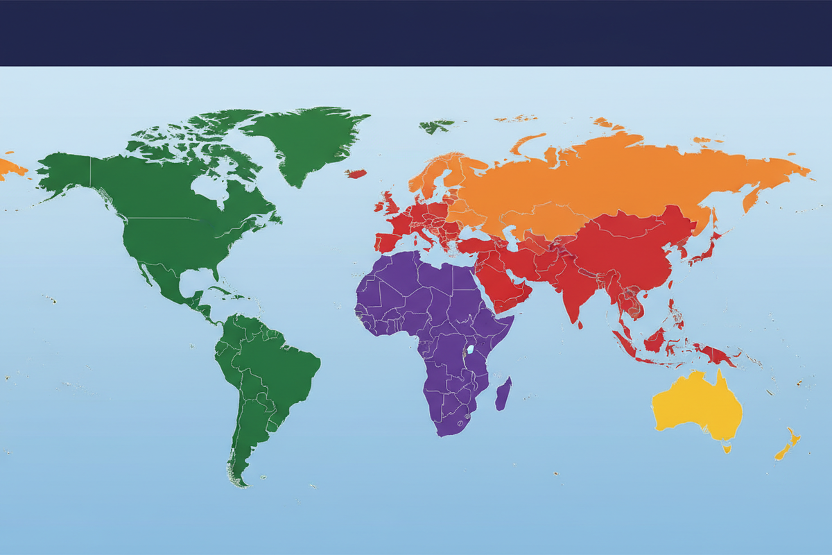
Imagine growing up your entire life believing that Greenland is roughly the same size as Africa. That Canada towers over the continental United States in a way that feels almost domineering. That Europe is a grand, sprawling landmass comparable in scale to South America. Now imagine discovering that nearly everything you visually absorbed from every classroom wall, every textbook, every Google Maps zoom-out view — was geometrically distorted in ways that fundamentally misrepresent the world we live in.
This is not a conspiracy theory. This is cartography. And the culprit has a name: the Mercator projection, a map design created in 1569 by Flemish geographer Gerardus Mercator. For over 450 years, this single map projection has shaped how billions of people perceive the relative size, importance, and significance of the world's continents and nations. And no continent has been more dramatically misrepresented than Africa.
Africa, the world's second-largest continent, covers approximately 30.37 million square kilometres — a landmass so vast it can comfortably contain the United States, China, India, most of Europe, and still have room left over. Yet on a standard Mercator projection map, Africa appears roughly the same size as Greenland, which is actually 14 times smaller.

Who Was Mercator and Why Did He Design This Map?
Gerardus Mercator was born in 1512 in Rupelmonde, in what is now Belgium. A mathematician, geographer, and cartographer of extraordinary talent, Mercator spent his career trying to solve one of the most vexing challenges of his era: how do you accurately represent a spherical planet on a flat piece of paper?
This is, mathematically speaking, impossible to do perfectly. A sphere and a flat plane are fundamentally different geometric objects. Any attempt to "unroll" a sphere onto a flat surface will necessarily introduce distortions — in shape, in area, in distance, or in direction. Every map projection ever created is a compromise, a trade-off between different types of accuracy.
Mercator's genius — and his lasting contribution to navigation — was creating a projection that preserved direction perfectly. On a Mercator map, a straight line between any two points represents a constant compass bearing. This property, called conformality or rhumb-line accuracy, was revolutionary for 16th-century sailors. If you were navigating by compass across open ocean, you could draw a straight line on a Mercator map and follow that bearing all the way to your destination. This was a lifesaving innovation in an era of transoceanic exploration.
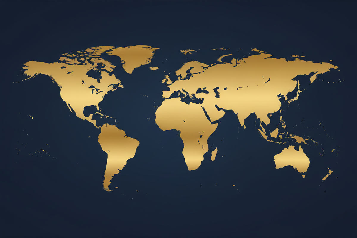
But the trade-off was severe. To preserve angles and shapes locally, Mercator's projection stretches landmasses increasingly as you move away from the equator. Greenland, located near the North Pole, is rendered approximately 14 times larger than its actual size relative to equatorial regions. Africa, straddling the equator, appears far smaller than it should relative to the bloated northern landmasses.
How Mercator Distortion Works: The Mathematics of Deception
To understand why the Mercator projection distorts the way it does, it helps to think about what happens when you try to flatten an orange peel. If you peel an orange and try to lay the skin flat, it tears, buckles, and refuses to lie smooth. The only way to make it lie perfectly flat is to stretch it — and the stretching is greatest at the edges, farthest from the centre.
The Mercator projection solves this problem mathematically by applying a systematic stretching formula. At the equator (0° latitude), this factor is 1 — no distortion. At 60° latitude (the latitude of St. Petersburg, Oslo, or Anchorage), the distortion factor is 2 — everything appears twice as large as it should. At 80° latitude (approaching the Arctic), the factor is approximately 5.76 — nearly six times the actual size.
This is why Greenland appears so enormous. Its actual area is approximately 2.17 million square kilometres — a fraction of Africa's 30.37 million square kilometres. On a Mercator map, they can appear comparable in size.
Africa's True Size: The Numbers That Will Shock You

Let us deal in facts. Africa covers 30.37 million square kilometres. This makes it the world's second-largest continent, after Asia (approximately 44.58 million km²). To put Africa's size in concrete terms:
The continental United States covers approximately 9.83 million square kilometres. You could fit the entire contiguous United States inside Africa approximately three times, with room left over for a country the size of India.
China covers 9.60 million square kilometres. Africa is more than three times the size of China.
India covers 3.29 million square kilometres. More than nine Indias fit inside Africa.
The entire European continent covers approximately 10.18 million square kilometres. Africa is nearly three times the size of Europe.
All of these combined — the USA, China, India, and Europe — total approximately 32.9 million square kilometres. Africa at 30.37 million km² is comparable to all four of these major regions put together.
Greenland covers just 2.17 million square kilometres. Africa is 14 times larger than Greenland.
The Colonial Legacy: Was It Intentional?
One of the most charged questions in the debate about map projections is whether the distortion that inflates Europe and minimises Africa was deliberately designed to serve colonial ideological purposes. Historians and geographers are divided on this question.
The case that it was not intentional is straightforward: Mercator designed his projection in 1569 primarily as a navigational tool, and the mathematical properties that cause polar distortion are inherent consequences of the conformal projection technique, not deliberate design choices.
However, the case that the widespread adoption of the Mercator projection served colonial interests — even if unintentionally — is harder to dismiss. By the 19th and early 20th centuries, when European colonial powers were actively dividing Africa among themselves (the Berlin Conference of 1884–1885), the Mercator map was the dominant world map in European and American schools. Children grew up seeing a map that made Europe appear large, central, and significant, while Africa appeared relatively small and peripheral.
What is certain: the map you grow up with shapes how you see the world. If that map consistently represents some regions as larger, more central, and more significant than they actually are, it inevitably affects how people perceive and value those regions and their inhabitants.
Alternative Map Projections and What They Reveal
The Mercator projection is far from the only way to represent the world on a flat surface. Here are the most significant alternatives:
The Gall-Peters Projection is an equal-area cylindrical projection that accurately represents the relative sizes of all land areas. Africa dominates the lower half of the map in a way that immediately signals its true size.
The Robinson Projection was adopted by National Geographic in 1988 as its standard world map — a compromise projection balancing area accuracy and shape accuracy.
The Winkel Tripel Projection replaced Robinson as National Geographic's standard map in 1998. It minimises overall distortion across three properties simultaneously and is considered among the most balanced general-purpose world maps available.
The Equal Earth Projection, developed in 2018 by cartographers Bojan Šavrič, Tom Patterson, and Bernhard Jenny, provides an equal-area world map that is also visually balanced and aesthetically pleasing — making it ideal for educational use. On Equal Earth, Africa's enormous area becomes immediately apparent.
The AuthaGraph Projection, developed by Japanese architect Hajime Narukawa and updated in 2016, won Japan's Good Design Award and is considered one of the most accurate flat representations of the world yet devised.
The UN Vote: What Actually Happened on September 4, 2026
On September 4, 2026, the United Nations General Assembly overwhelmingly approved a landmark resolution calling for more balanced representation of the world's geography. The resolution, titled "Correct the Map: Rebalancing Global Cartographic Representation and Promoting Equitable Representation of the World's Regions, Particularly Africa," passed by 164 votes to one, with six countries abstaining. The United States was the sole country to vote against it.

The campaign behind the resolution, led by Togo and supported by the African Union, argues that the widespread use of the Mercator projection has created a misleading visual impression of the relative size of continents, especially Africa. Togolese Foreign Minister Robert Dussey framed the argument eloquently: "A fair map does not change the geography of the world — it changes how people see the world."
Critically, this was not a ban on Mercator. The resolution is non-binding. It does not force governments to remove Mercator maps from classrooms or prohibit navigational uses of the projection. Rather, it encourages governments, educational institutions, international organizations, media, and technology companies to favour projections that represent land area more accurately when geographic size is relevant. The Equal Earth projection has emerged as the principal symbol of this campaign.
France announced in September 2026 that it would move away from Mercator for its official world maps in favour of the Eckert IV projection — another equal-area design. This demonstrates that "correcting the map" does not mean everyone must use a single replacement projection; rather, it is about choosing the right tool for the right purpose.
The vote also produced a striking geopolitical result. The six abstaining countries were Estonia, Georgia, Lithuania, Moldova, Serbia, and Ukraine. Washington criticized the initiative as ideological, arguing that the UN should focus on more substantive global challenges. Yet the overwhelming 164-vote majority indicates that most UN members regarded the symbolic and educational value of the initiative as worthwhile.
Viral Maps and Misinformation: What to Watch Out For
The rise of social media has created a new phenomenon: viral map misinformation. As awareness of Mercator distortion has spread, some content creators have begun producing deliberately misleading graphics that exploit this awareness to spread false information.
A common pattern is to create a graphic claiming some official body has "officially recognised" Africa as the largest continent, complete with fabricated vote tallies and invented statistics. These graphics spread rapidly because they tap into a genuine and valid concern — while embedding completely false claims within that valid context.
It is important to be clear: Africa is not the largest continent. Asia is. Asia covers approximately 44.58 million square kilometres, making it nearly 47% larger than Africa. This is a straightforward physical reality agreed upon by all credible geographic sources. The UN September 2026 resolution was about promoting equal-area map projections — not reclassifying Africa as the largest continent.
The truth about Africa's size is remarkable and important enough on its own merits. It does not need embellishment.
Why Map Literacy Matters in the Modern World
Maps are not neutral documents. They are representations of the world made by specific people at specific times for specific purposes, and they always reflect the knowledge, assumptions, and priorities of their creators.
Map literacy matters for several interconnected reasons. First, it affects geopolitical perception — how large a country appears on a map influences how significant it is perceived to be. Second, it matters for economic and development thinking. Africa contains extraordinary natural resources, a rapidly growing population projected to reach 2.5 billion by 2050, and the world's largest free trade area (the African Continental Free Trade Area, launched in 2021). Third, it matters for education — children who grow up with distorted maps absorb distorted perceptions of the world. And finally, it matters in the age of digital misinformation, where the ability to critically evaluate a map is an essential critical thinking skill.
Perhaps the biggest practical impact of the UN resolution will occur in schools. If the purpose of a lesson is to compare the sizes of continents, an equal-area map communicates the concept far more effectively. Imagine a child seeing Africa and Greenland side by side: on a Mercator map, the two may appear surprisingly similar; on an equal-area projection, their enormous difference becomes immediately obvious.
Africa Today: A Continent of Staggering Scale and Potential
Beyond the map debate, it is worth pausing to appreciate what Africa's true size actually means in human terms. Africa is home to 54 recognised countries, over 1.4 billion people, and an estimated 2,000 languages. It contains the world's longest river (the Nile, approximately 6,650 km), the world's largest hot desert (the Sahara, 9.2 million km² — itself larger than the continental United States), the world's second-largest tropical rainforest (the Congo Basin), and some of the world's most biodiverse ecosystems.
Africa is also the birthplace of humanity. The earliest known Homo sapiens fossils, dated to approximately 300,000 years ago, were found in Morocco. In the most literal sense, Africa is everyone's homeland.
Economically, Africa is undergoing a transformation. The African Continental Free Trade Area, which came into force in 2021, is the world's largest free trade area by number of participating countries. Africa's population is the youngest of any continent, with a median age of approximately 18 years — a demographic profile that represents an enormous potential economic asset.
Understanding Africa accurately — in its true geographic dimensions, its actual economic weight, its historical significance, and its future potential — requires first unlearning the distorted image that generations of Mercator maps have embedded in our collective consciousness. The map is not the territory. But the map shapes how we see, think about, and engage with the territory. Getting the map right matters.
The deeper importance of the UN decision may have little to do with paper maps. It may be about mental maps — the internal pictures every person carries of the world. A more accurate map tells a simple truth: Africa is enormous. And an equal-area projection makes that reality immediately, undeniably visible.
Frequently Asked Questions
Q: Is Africa actually the largest continent?
A: No. Asia is the world's largest continent, covering approximately 44.58 million square kilometres. Africa is the second-largest at approximately 30.37 million square kilometres.
Q: What did the UN actually vote on in September 2026?
A: The UN General Assembly passed a non-binding resolution encouraging governments, schools, media, and technology companies to favour equal-area map projections when geographic size is relevant. It did not ban Mercator or declare Africa the largest continent.
Q: Why does Africa look small on most maps?
A: Most commonly used world maps use the Mercator projection, which mathematically stretches landmasses as they approach the poles, making northern regions appear much larger than they actually are relative to equatorial regions.
Q: How big is Africa compared to Europe?
A: Africa (30.37 million km²) is approximately three times the size of Europe (10.18 million km²).
Q: What is the Equal Earth projection?
A: An equal-area world map projection developed in 2018 by Bojan Šavrič, Tom Patterson, and Bernhard Jenny. It accurately represents relative land areas while remaining visually balanced and recognisable — making it ideal for educational maps.
Q: What is the most accurate world map?
A: No flat map can perfectly represent a sphere. For general reference, the Winkel Tripel and AuthaGraph projections are widely considered among the most balanced. The Gall-Peters and Equal Earth projections are most accurate for comparing relative land areas.
Q: Why do we still use the Mercator projection?
A: Partly historical inertia, and partly because it remains genuinely useful for navigation and displaying local areas. Digital mapping tools like Google Maps use a Mercator variant because it simplifies zoom-level mathematics. Awareness of its limitations has grown significantly, and many educational materials now use more accurate projections.
Sources & References
- United Nations General Assembly Resolution, September 4, 2026 — "Correct the Map: Rebalancing Global Cartographic Representation."
- Reuters. "UN votes to promote equal-area maps over Mercator projection." September 2026.
- AP News. Coverage of the UN cartography resolution vote, September 2026.
- The Washington Post. "The world just voted to change its maps. Here's what that means." September 2026.
- Le Monde. "La France adopte la projection Eckert IV pour ses cartes officielles." September 2026.
- The Times of India. "India backs UN map resolution with border representation caveat." September 2026.
- Jacaranda FM. Coverage of the UN equal-area map resolution, September 2026.
- Global Issues. "Togo leads Africa's 'Correct the Map' campaign at the UN." 2026.
- Šavrič, B., Patterson, T., & Jenny, B. (2018). "The Equal Earth map projection." International Journal of Geographical Information Science.
- Snyder, J.P. (1987). Map Projections: A Working Manual. U.S. Geological Survey.
- Monmonier, M. (1991). How to Lie with Maps. University of Chicago Press.
- The True Size Of. Interactive Mercator distortion tool. thetruesize.com
- United Nations. Geospatial guidance on map projections. un.org
- African Union. African Continental Free Trade Area (AfCFTA). au.int
- NASA Earth Observatory. Continent areas and measurements. earthobservatory.nasa.gov